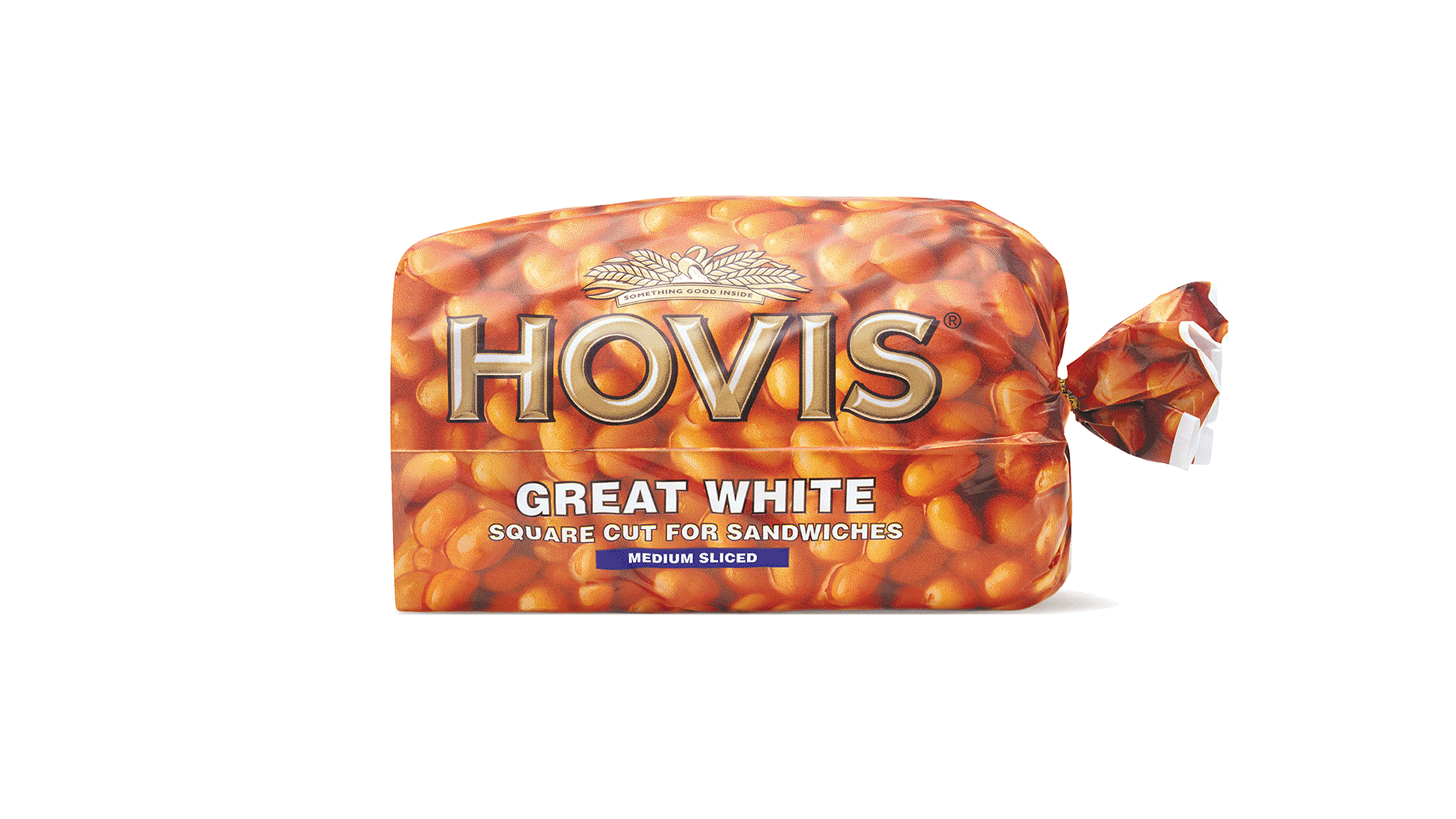
Having grown frustrated with the commoditization of the bread category, Hovis needed a big idea that told the story of versatility. The solution was to wrap each pack in the food we love to eat with bread. After the re-design, Hovis became the UK’s fastest growing grocery brand adding £86M profit to British Bakeries bottom line.
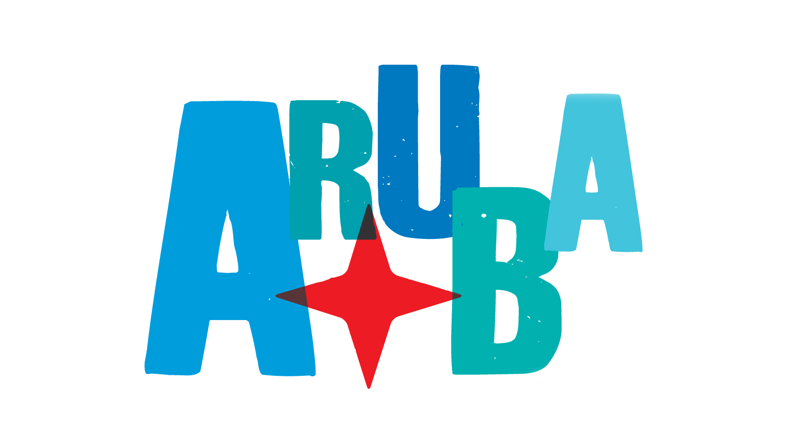
Commissioned by the Aruba Tourism Authority, the island wanted to align its identity with a historical tagline, ‘one happy island’. The tagline had a strong identification with the local community and tourists. The ‘red compass rose’ is from Aruba’s national flag, representing the national pride of the island. The placement and style of the typography reflects a playful attitude, while the colors echo the island’s natural environment.
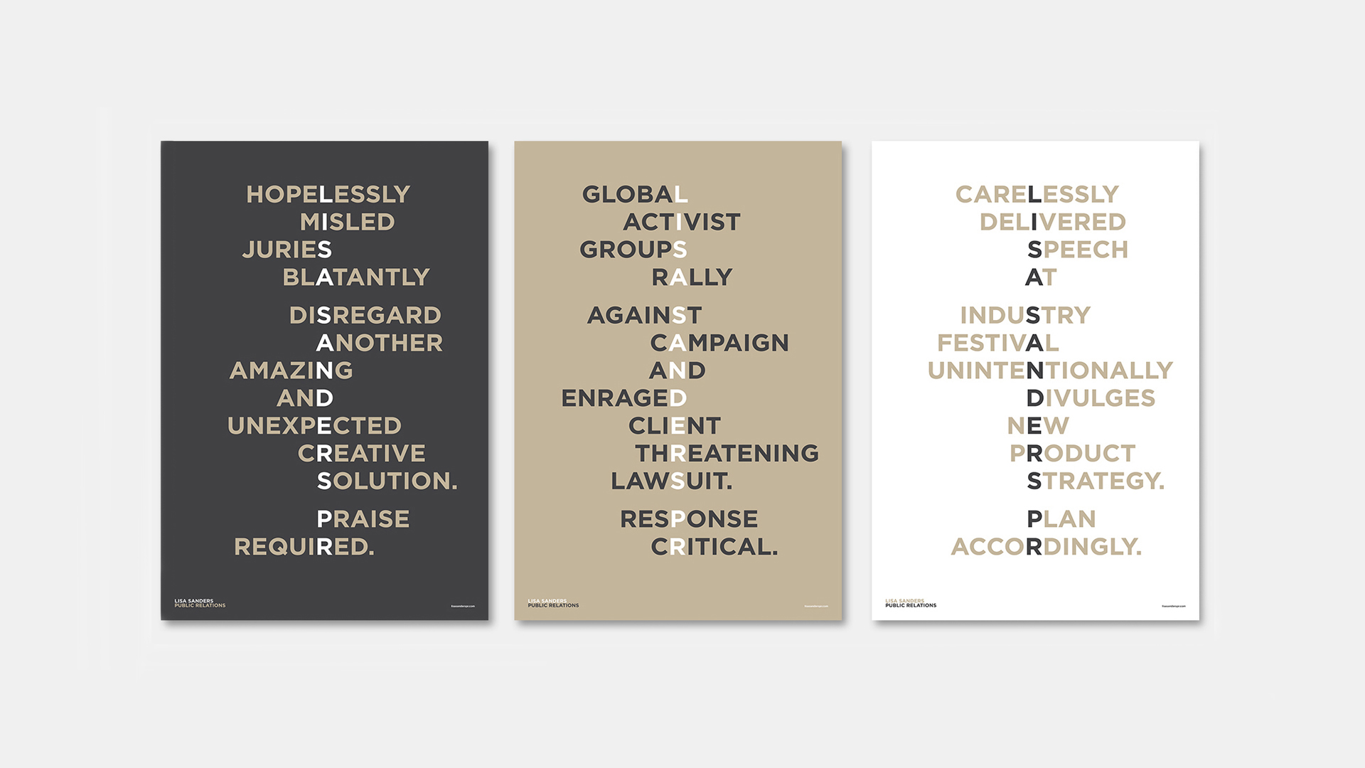
Specializing in the creative industry, the identity was designed to instantly impart the company’s understanding of the various public relations challenges agencies may face. Impactful design language was employed to bring a straightforward yet humorous nature to these expressions.
Founded in 1995, the club was an inaugural franchise in the MLS. The re-design, the first in the club’s history, needed to be respectful of past while creating a simplified, more iconic identity.
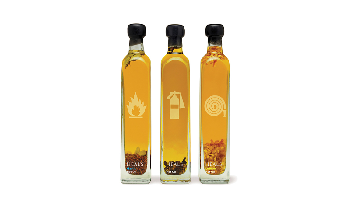
The British retail store has for over two centuries promoted modern design and with a slogan is "Nothing Need Be Ugly", these HOT salad oils needed to live up to that ethos.
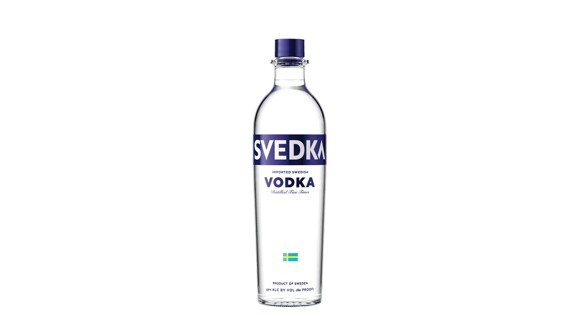
Wanting to break into the top 5 vodka brands, the new design needed to sit comfortably in a chic city club, while retaining a mass market appeal. Svedka became the fastest growing imported premium vodka in the United States and was later sold to Constellation Brands for $384 million.
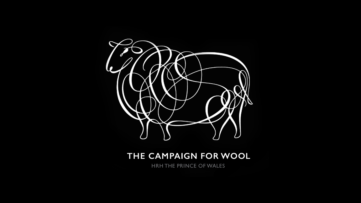
With HRH The Prince of Wales as patron, the Campaign for Wool is a coalition working to raise the profile of wool as the natural sustainable fibre.